While I had a little free time over the weekend, I really, really wanted to at least get down a poster idea for one of GOATBEDs songs, which was another song that I unfortunately didn’t choose for the final three songs. I made a little sketch of an idea I had for the song ‘Yama-ha’. This time, I wanted to try and play around with a different kind of medium for the creation of this poster and that medium would be Promarkers this time, as when it comes to this song in particular, it’s very soothing to my ears and yet, there would be other times where it creates this ball of burning energy inside of me.
I decided as this in a way would be still playing around with brush strokes, except this time it would be with the brush on the pen tips.
Concerntrating on the song, I notice that all of my other senses seem to shut off and only my ears are picking up on the sounds of the beat being created. I imagine myself being the only person around; the atmosphere shadows out and there’s an array of bright, vibrant colours that illuminate my path and all I can hear is YAMA-HA playing in the distance.

I made it so, the figure was being absored in to the cast of shadows. I used a normal pen for this, owing to there are times where the song has this very edgy sensation. I’m a little unhappy with how the kneck turned out, as I don’t usually draw the body form from this angle; it was pretty challenging.
After colouring in with more vibrant colours, I was hesitant to leave it as just as it was. There had to be something that could fill that blank void. I thought about probably filling it in black, but that would leave the image looking dull. I found a photograph from the previous photography session, which had been an error of one of my tests, so I placed it down on a new layer in Photoshop and played around with the clipping mask.

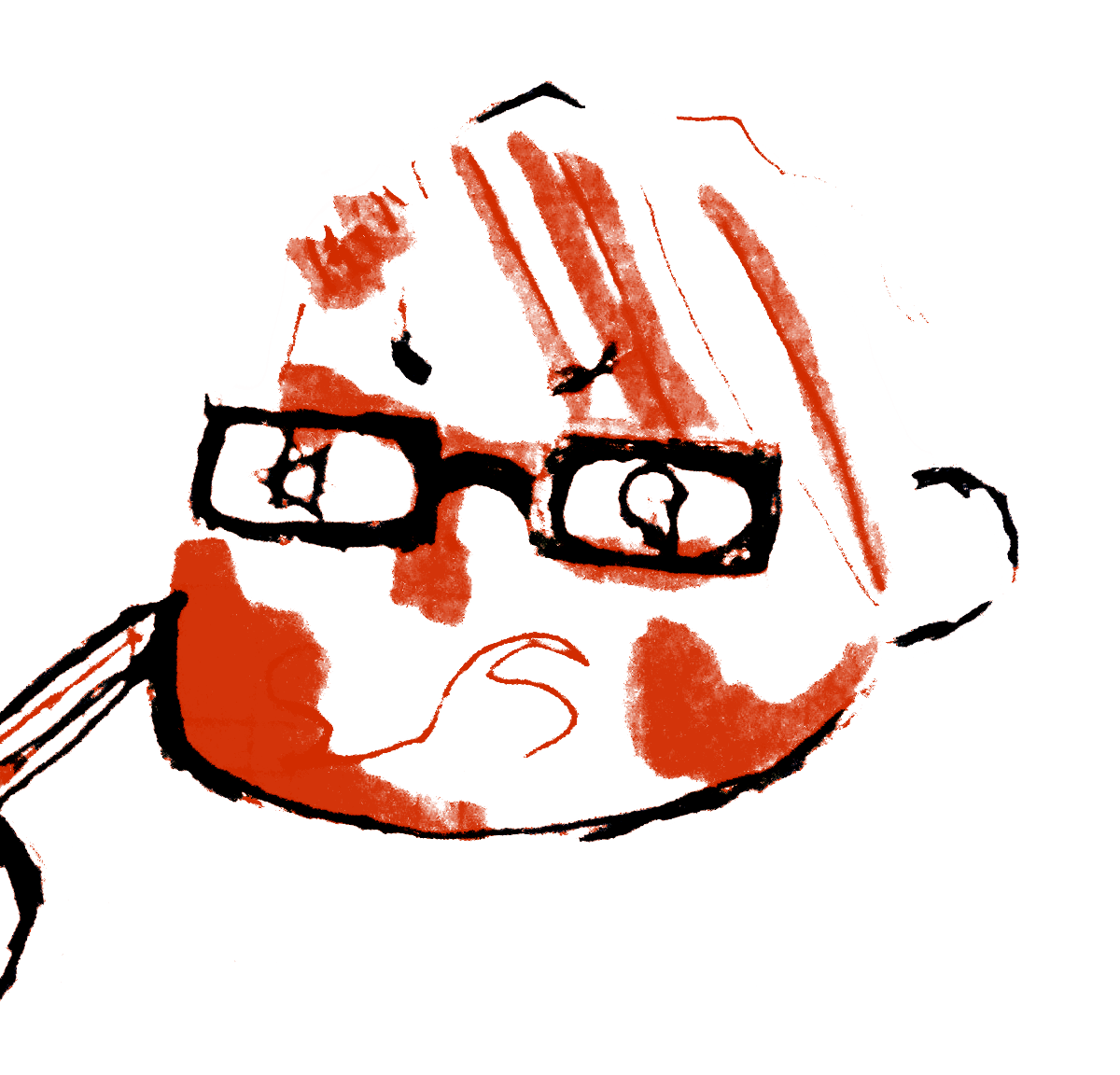
I was frustrated with this outcome. It was too sharp and the line quality was terrible; I know i will never be satisfied with any of these kind of drawings, but the only thing that I was quite pleased with was how the colours bodly stand out among the shades of grey.

I set the layer to multiply this time. A bit nicer, different. It’s starting to grasp that edgy feeling I wanted.


I despised the corners around the image. They somehow made the image look flat; I didn’t want that, therefore, I used a soft eraser setting to lightly brush it away.
I had to keep thinking back to what I researched about in the project; how can I capture that raw emotion? how can I portray that? To be quite blunt with this, I don’t think the images for this poster are quite there yet. What I’ve obtained from this song is difficult to depict, and yet, that didn’t stop me from testing this idea out further. I considered that maybe, I could try animating all of these outcomes together to see what I get.


Yes please animate!
LikeLike