Taking these images a bit further, I tried to consider the change in colours with it. I decided that my first approach with colour would be through primary colours, and green only, in consideration of the Riso printer.

Starting off, I tried out two of my favourite combinations. Green with red with two of the patterns I had created with pen and ink from the ‘Walk the line’ every day’s drawings. I found these two patterns to be quite opposite towards each other, as one was smooth and the other was quite sharp.
I simply collaged those together to start giving me more of an idea in how I could pursue the space I have.

Again, switching the colours around, in the end, I do prefer the green with the red. It seems more subtle.


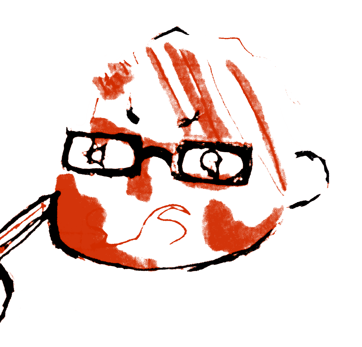
Taking this further, I found a drawing which was the original idea for the male used in one of hte gifs, I had developed. Re-using this again, I tried to see how it would work out, if I were to overlay it with the other patters. I felt that the image was a little too big, but then again, I also thought that it should take up the space somehow.


After figuring this point out, I decided to use this face as a repetitive pattern and just see where it would lead me. Happy with how it turned out, I decided to once again try playing around with the colours I was most satisfied with. I might try returning to this test again in near future, but with other images.
Lastly, I wanted to see how this may work on two separate A3 pages, but with type included. I wanted to show something bold, vibrant and colourful.


